Meet the Maker: Grace Erskine
In our latest ‘meet the maker’ post, we talk to Grace Erskine, founder of Erskine Rose. Grace’s latest collaboration with Dulwich Picture Gallery responds to the colours of key paintings in our Collection, and celebrates our 'Unlocking Paintings' project.
Shop the Erskine Rose Colour range >>
How did you get started as a designer?
I went to art school to study Fine Art, and focused on sculpture. After university I carried on with sculpture for a while but I wasn’t sure it was the right direction for me, so I started to think of what I could do instead. Creating and making was still important to me, so I came up with the idea of producing homewares, stationery and candles with my artwork printed on.
Do you think the understanding of sculpture you gained during your Fine Art studies still informs your work?
Yes, I think the way I’ve been trained to look at and create art definitely informs my work. I see my products more as pieces of art than purely functional objects. They’re designed to have a fine art quality and feel. This is particularly true of the pieces I designed for Dulwich Picture Gallery, which were inspired by specific paintings in their Collection.
Could you tell us about your new range for Dulwich Picture Gallery?
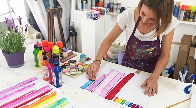
When I first collaborated with the Gallery I produced a tea towel design; this became the starting point for my new range. From there, I looked at the Collection and the variety of colours it contained. Colour is very important to me, so it’s always something I like to explore. When looking at the paintings I also considered textures, patterns, objects, feelings, moments in time, and anything that brought all the printings together (this is why I decided to look at skies, for example).
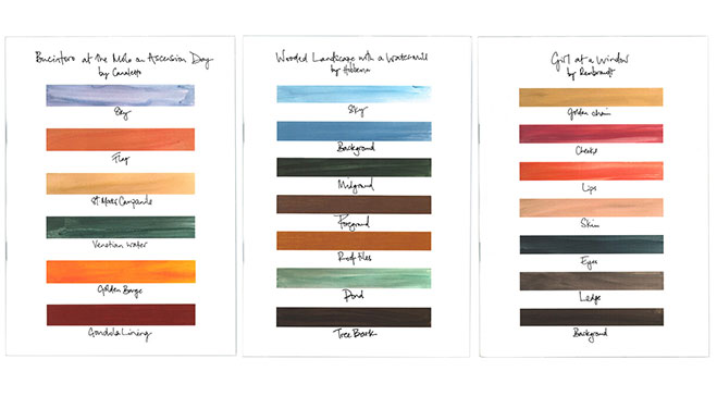
After all this research I created a series of colour charts for each painting, taking into account all these elements. I then decided what did and didn’t work. Looking at these pieces, Sonia [Head of Retail at Dulwich Picture Gallery] and I decided the most effective pieces were those that took specific colours from the paintings, for example the eyes, skin or background. I wanted the products in this range to have my contemporary, bold style so I tried to pick out the colours that drew my eye in the most.
How did you choose which paintings from the Collection to use as inspirations for your designs?
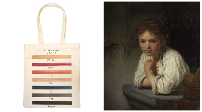
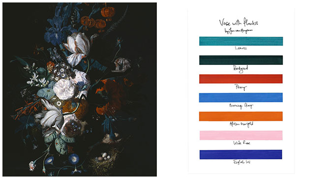
I focused on four paintings that really caught my eye, as well as being popular with visitors and some of the most iconic within the Collection. These were Rembrandt’s 'Girl at a Window', Hobbema’s ‘Wooded Landscape with a Watermill’, ‘Bucintoro at the Molo on Ascension Day’ by Canaletto, and ‘Vase with Flowers’ by Van Huysum. With a range of colours selected from each painting, I played with the layout and included writing in some of the designs. This writing empahises the idea of a colour chart and, particularly as it’s handwritten, evokes colour charts that would have been used when these works were painted.
Your new range celebrates the gallery’s Unlocking Paintings project – in what ways do you think contemporary design can ‘unlock’ artworks?
New designs can make older artworks more accessible to younger, more contemporary audiences. Seeing a new design inspired by a familiar artwork can also make you see that piece of art in a new light, highlighting things you hadn’t noticed before, or encouraging you to ask more questions about the why, what, where and when of a painting.
Colour has a significant place in your work – how do you decide on a colour palette for your artworks?
Bright and bold colours that stand out are the ones I am immediately attracted to. I like to think I have quite a good eye for colour, and I take inspiration from everywhere I go and everything I see – I’m always looking out for colours around me. Experimentation is also important for seeing what works, and for moving forward with the best palette.